
Go Back


2025
An Investment app concept designed to make investing feel clearer and more approachable
Timeline
July - Oct 2025
Role
Product Designer

OVERVIEW
Sora is an investment app concept focused on helping users invest with more clarity and less friction.
The project began as an AltSchool product design assessment, but I continued expanding it beyond the initial scope by designing additional flows across onboarding, deposits, portfolio management, and stock discovery.
The goal was to explore what an investment experience looks like when the interface prioritises pacing, structure, and user confidence, especially during high-trust moments like funding an account.
THE PROBLEM
Most investment products are built to serve experienced users: they surface a lot of data early, assume financial familiarity, and optimise for speed.
That approach works, but it also creates a gap for users who are still building confidence.
With Sora, I wanted to explore a different balance:
- How can an investment product stay functional without feeling dense?
- How do you help users make decisions without overwhelming them?
- What does “calm” look like beyond aesthetics, especially in transactional flows?
THE THINKING
- Setting context early
Rather than using onboarding as a generic welcome sequence, I designed it as a short set of questions that helps the product understand the user’s context:
- Where are you in your investing journey?
- What are you investing for?
- How comfortable are you with risk?
- What types of investments interest you?
This makes onboarding feel purposeful, while keeping it lightweight.
Key Lesson #1
Good onboarding starts with empathy. New users need reassurance and context, but it should stay quick and lightweight.
- A portfolio you canread quickly
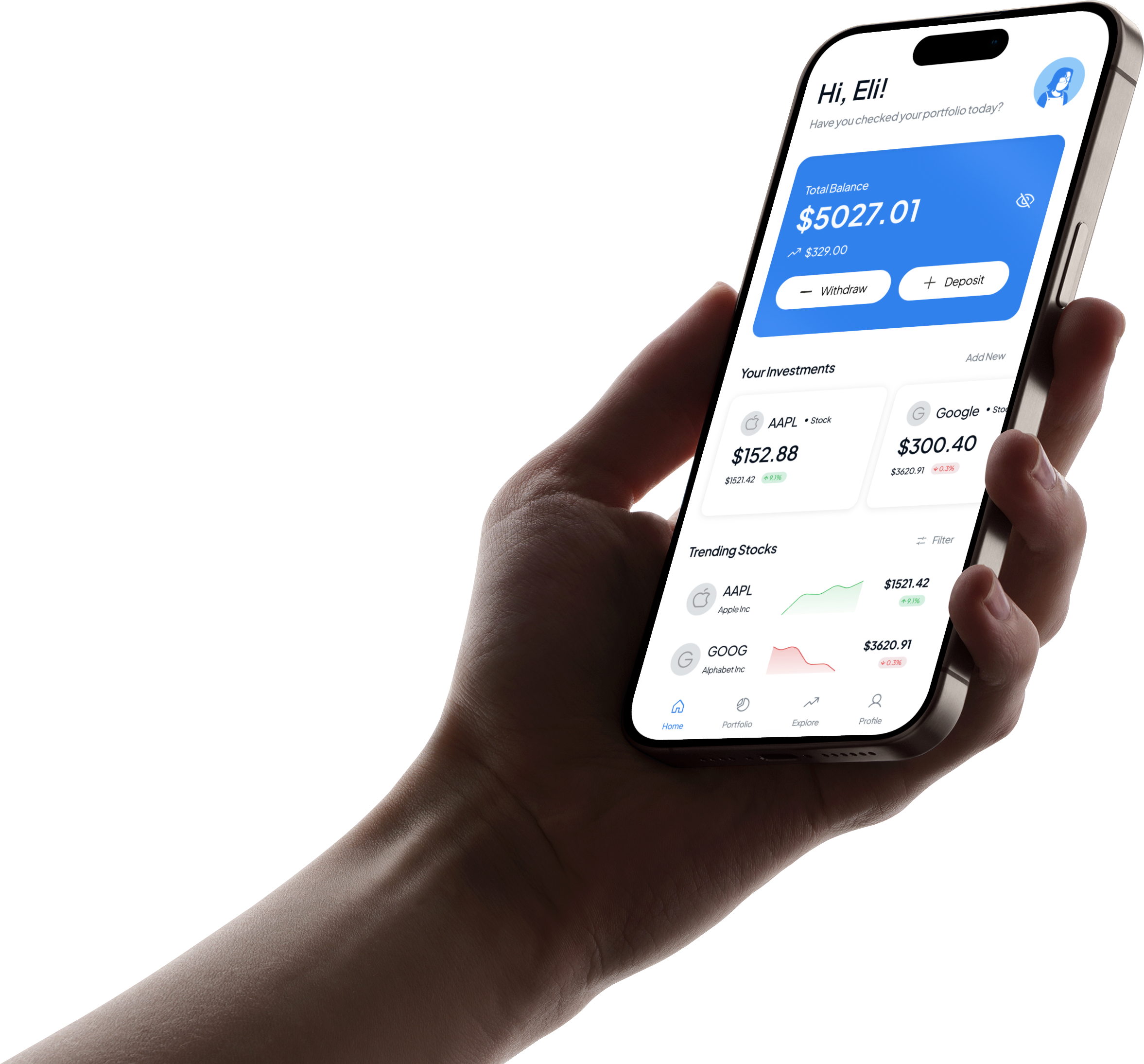
The portfolio screen was designed to give users a clear snapshot of their account without making them work for it.
The first layer focuses on the essentials: total balance, performance, and holdings. Secondary details are intentionally deferred so the screen doesn’t feel like a dashboard full of numbers.
This was especially important because for most users, the portfolio is the screen they return to the most. It needed to feel stable, readable, and easy to act from, whether the next step is depositing or exploring stocks.
Key Lesson #2
Emotion and velocity. Make people feel something and move fast while doing it.
- Deposits as a guided flow
Depositing money is one of the most sensitive actions in an investment app, so I treated it as a complete flow rather than a single tap.
The deposit experience moves through:
- amount entry
- payment method selection
- review step
- confirmation / success state
Each step is designed to reduce uncertainty and make it clear what is happening before money moves.
Key Lesson #3
Deposit flows get overwhelming fast. The challenge is sharing what matters while still making the user feel secure.
- Discovery without overload
Explore supports stock discovery and browsing in a lightweight way.
Instead of surfacing too much market information at once, the screen introduces trending stocks and simple navigation into a buy decision. The goal was to make discovery feel approachable, especially for users who may not know what to search for yet.
Key Lesson #4
Emotion and velocity. Make people feel something and move fast while doing it.
THE SYSTEM
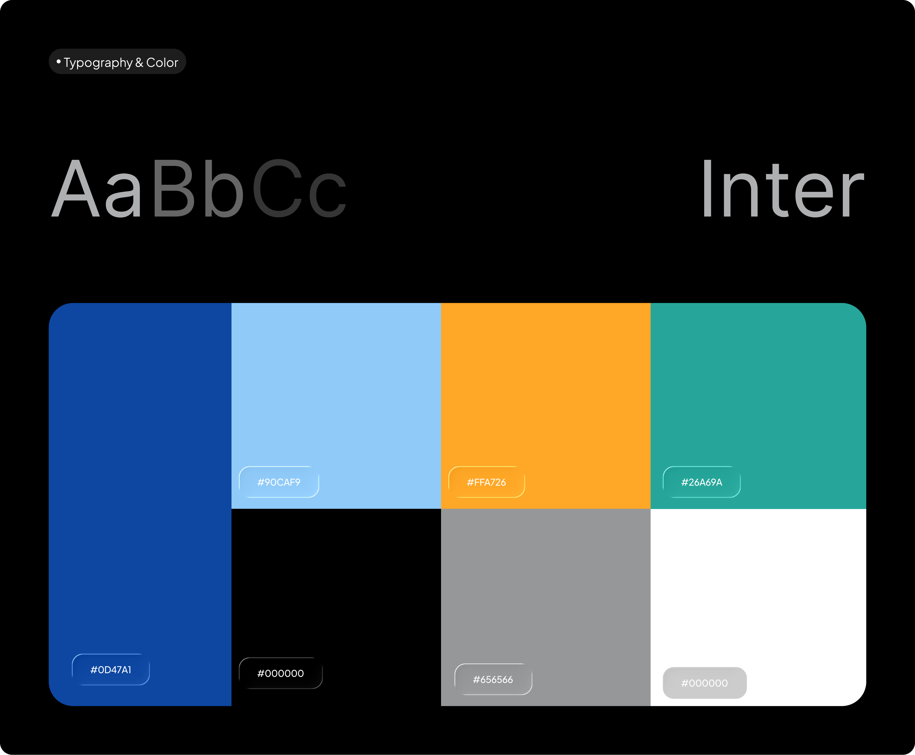
Before designing screens, I set up a basic design system to keep the product consistent as it expanded.
This included:
- typography styles
- colour styles
- reusable components
- variables for light and dark mode
As more flows were added, the system helped reduce inconsistency and made iteration faster.
Heading

Large
Medium
Small
32 px
28 px
24 px
SemiBold
SemiBold
Medium
Title
Large
Medium
Small
22 px
16 px
14 px
Medium
Medium
Medium
Body
Large
Medium
Small
16 px
14 px
12 px
Regular
Regular
Regular
Aa
Bb
Cc
Cool project? Cool people?
My inbox is open ;p
hi@elisha.ma


Go Back

2025
An Investment app concept designed to make investing feel clearer and more approachable
Timeline
July - Oct 2025
Role
Product Designer
OVERVIEW
Sora is an investment app concept focused on helping users invest with more clarity and less friction.
The project began as an AltSchool product design assessment, but I continued expanding it beyond the initial scope by designing additional flows across onboarding, deposits, portfolio management, and stock discovery.
The goal was to explore what an investment experience looks like when the interface prioritises pacing, structure, and user confidence, especially during high-trust moments like funding an account.
THE PROBLEM
Most investment products are built to serve experienced users: they surface a lot of data early, assume financial familiarity, and optimise for speed.
That approach works, but it also creates a gap for users who are still building confidence.
With Sora, I wanted to explore a different balance:
- How can an investment product stay functional without feeling dense?
- How do you help users make decisions without overwhelming them?
- What does “calm” look like beyond aesthetics, especially in transactional flows?
THE THINKING
- Setting context early
Rather than using onboarding as a generic welcome sequence, I designed it as a short set of questions that helps the product understand the user’s context:
- Where are you in your investing journey?
- What are you investing for?
- How comfortable are you with risk?
- What types of investments interest you?
This makes onboarding feel purposeful, while keeping it lightweight.
Key Lesson #1
Good onboarding starts with empathy. New users need reassurance and context, but it should stay quick and lightweight.
- A portfolio you canread quickly
The portfolio screen was designed to give users a clear snapshot of their account without making them work for it.
The first layer focuses on the essentials: total balance, performance, and holdings. Secondary details are intentionally deferred so the screen doesn’t feel like a dashboard full of numbers.
This was especially important because for most users, the portfolio is the screen they return to the most. It needed to feel stable, readable, and easy to act from, whether the next step is depositing or exploring stocks.
Key Lesson #2
Emotion and velocity. Make people feel something and move fast while doing it.
- Deposits as a guided flow
Depositing money is one of the most sensitive actions in an investment app, so I treated it as a complete flow rather than a single tap.
The deposit experience moves through:
- amount entry
- payment method selection
- review step
- confirmation / success state
Each step is designed to reduce uncertainty and make it clear what is happening before money moves.
Key Lesson #3
Deposit flows get overwhelming fast. The challenge is sharing what matters while still making the user feel secure.
- Discovery without overload
Explore supports stock discovery and browsing in a lightweight way.
Instead of surfacing too much market information at once, the screen introduces trending stocks and simple navigation into a buy decision. The goal was to make discovery feel approachable, especially for users who may not know what to search for yet.
Key Lesson #4
Emotion and velocity. Make people feel something and move fast while doing it.
THE SYSTEM
Before designing screens, I set up a basic design system to keep the product consistent as it expanded.
This included:
- typography styles
- colour styles
- reusable components
- variables for light and dark mode
As more flows were added, the system helped reduce inconsistency and made iteration faster.
Heading

Large
Medium
Small
32 px
28 px
24 px
SemiBold
SemiBold
Medium
Title
Large
Medium
Small
22 px
16 px
14 px
Medium
Medium
Medium
Body
Large
Medium
Small
16 px
14 px
12 px
Regular
Regular
Regular
Aa
Bb
Cc
Cool project? Cool people?
My inbox is open ;p
hi@elisha.ma
Go Back
2025
An Investment app concept designed to make investing feel clearer and more approachable
Timeline
July - Oct 2025
Role
Product Designer

OVERVIEW
Sora is an investment app concept focused on helping users invest with more clarity and less friction.
The project began as an AltSchool product design assessment, but I continued expanding it beyond the initial scope by designing additional flows across onboarding, deposits, portfolio management, and stock discovery.
The goal was to explore what an investment experience looks like when the interface prioritises pacing, structure, and user confidence, especially during high-trust moments like funding an account.
THE PROBLEM
Most investment products are built to serve experienced users: they surface a lot of data early, assume financial familiarity, and optimise for speed.
That approach works, but it also creates a gap for users who are still building confidence.
With Sora, I wanted to explore a different balance:
- How can an investment product stay functional without feeling dense?
- How do you help users make decisions without overwhelming them?
- What does “calm” look like beyond aesthetics, especially in transactional flows?
THE THINKING
- Setting context early
Rather than using onboarding as a generic welcome sequence, I designed it as a short set of questions that helps the product understand the user’s context:
- Where are you in your investing journey?
- What are you investing for?
- How comfortable are you with risk?
- What types of investments interest you?
This makes onboarding feel purposeful, while keeping it lightweight.
Key Lesson #1
Good onboarding starts with empathy. New users need reassurance and context, but it should stay quick and lightweight.
- A portfolio you canread quickly
The portfolio screen was designed to give users a clear snapshot of their account without making them work for it.
The first layer focuses on the essentials: total balance, performance, and holdings. Secondary details are intentionally deferred so the screen doesn’t feel like a dashboard full of numbers.
This was especially important because for most users, the portfolio is the screen they return to the most. It needed to feel stable, readable, and easy to act from, whether the next step is depositing or exploring stocks.
Key Lesson #2
Emotion and velocity. Make people feel something and move fast while doing it.
- Deposits as a guided flow
Depositing money is one of the most sensitive actions in an investment app, so I treated it as a complete flow rather than a single tap.
The deposit experience moves through:
- amount entry
- payment method selection
- review step
- confirmation / success state
Each step is designed to reduce uncertainty and make it clear what is happening before money moves.
Key Lesson #3
Deposit flows get overwhelming fast. The challenge is sharing what matters while still making the user feel secure.
- Discovery without overload
Explore supports stock discovery and browsing in a lightweight way.
Instead of surfacing too much market information at once, the screen introduces trending stocks and simple navigation into a buy decision. The goal was to make discovery feel approachable, especially for users who may not know what to search for yet.
Key Lesson #4
Emotion and velocity. Make people feel something and move fast while doing it.
THE SYSTEM
Before designing screens, I set up a basic design system to keep the product consistent as it expanded.
This included:
- typography styles
- colour styles
- reusable components
- variables for light and dark mode
As more flows were added, the system helped reduce inconsistency and made iteration faster.
Heading

Large
Medium
Small
32 px
28 px
24 px
SemiBold
SemiBold
Medium
Title

Large
Medium
Small
22 px
16 px
14 px
Medium
Medium
Medium
Body
Large
Medium
Small
16 px
14 px
12 px
Regular
Regular
Regular
Aa
Bb
Cc
Cool project? Cool people?
My inbox is open ;p
hi@elisha.ma