
Go Back


2026
An Investment app concept designed to make investing feel clearer and more approachable
Timeline
February 2026
Role
Product Designer & Developer
OVERVIEW
Memos is an invite-only social app born out of being genuinely tired of mindless scrolling.
It started on February 20th, 2026. I was tired of opening six different apps to know what my friends were up to. Twitter for opinions. Instagram stories for updates. Snapchat for streaks. WhatsApp for messages. iMessage for more messages. It was too much, and none of it felt like it was actually for me and my people.
The four things that kept coming up in every conversation with friends were always the same: what they were thinking, reading, watching, listening to. We were always consuming something, always turning ideas over. But there was no one place to put it all — just for your circle, without the noise.
So I decided to build it. The irony of solving a too-many-apps problem with another app is not lost on me. But the difference is intention. Memos is invite-only, private by default, and built for depth over reach. No algorithm. No performing for strangers. Just your people.
I designed it, and then I brought it to life with code.
THE PROBLEM
Before I touched Figma I wrote everything down; the problem, the features, what I actually wanted this product to feel like
I built a v1 PRD and a design system from scratch: typography, colour, components. I wanted the product to feel quiet and considered, so I made sure the foundation reflected that before a single screen existed.
With Memos, I wanted to explore a different question:
- What if a social app was private by default?
- What if it was built for depth over breadth?
- What if the feed only had people you actually loved?
THE THINKING
- Starting with the concept, not the screen
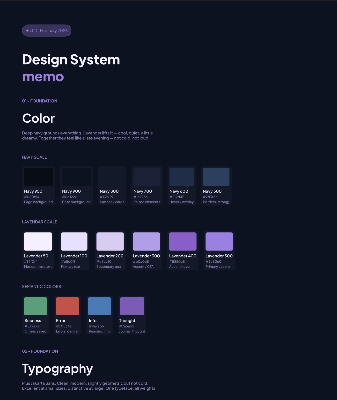
The design system came first. Before any screens, I built the foundation — typography, colour, components. I wanted the product to feel deliberate and considered, and that had to start at the system level.
The colour story started with two things: deep navy and lavender. Navy grounds everything: it's the base, the background, the weight, it is also a familiar dark shade. Lavender lifts it. Cool, quiet, a little dreamy. Together they feel like a late evening. I built out a full navy scale and lavender scale, plus semantic colours for the content types: green for saved, red for errors, blue for info, and a softer purple specifically for thoughts and journal entries.
For typography I chose Plus Jakarta Sans — clean and modern. One typeface, all weights, and it holds up at every size from display down to body text. The type scale was written in the language of the product itself: "your little world," "what's going on," "your friends, lately" ; Defining the product language and voice before designing.
Key Lesson #1
The product has to feel like itself before any screens exist. That's what a design system is for.
- Building a destination for memos
The landing page came next. I made an early call to ship a waitlist before building the full product — partly to get something out into the world, partly to pressure-test whether people actually wanted this. I kept asking myself whether a landing page was just prolonging the journey. I looked at how Twitter and Bluesky handle first visits — neither has one. But those are established products that people already know. Memos needed to earn the click first.
The structure was straightforward: nav, hero, a mid-section for context, a terminology translator (memos has its own language) and a footer. Getting it from Figma to code was a different story. Claude is fast, it'll generate 200 lines of HTML in seconds, but it doesn't have taste and it doesn't know your spacing system unless you force it to. So the workflow became:
- Design in Figma
- Ask Claude to translate the structure
- Rewrite half of it
- Fix spacing manually
- Debug when it broke.
I call it hybrid code. AI speeds up the structure, but the taste is still on you.
The waitlist had its own problem. I was using Tally to collect emails, but my landing page already had an email input — meaning users would type their email, get redirected to Tally, and be asked for it again. One unnecessary step. I figured out how to pass the email as a URL parameter so Tally prefilled it on arrival. A small fix, but it mattered.
Then came deployment — GitHub, then Vercel. A URL was born.
Key Lesson #2
Taste is how you spot errors. AI speeds up structure, not taste. Read my article on building memos landing page here
- Onboarding as a guided and deliberate experience
Onboarding was where I spent the most time thinking. For a product that only works with friends, it couldn't just be account setup — it had to be a guided introduction to what memos even is. New product, new concept, new behaviour. I couldn't just drop someone into a feed and hope they figured it out.
I approached the design as a journey with a clear job to do at each step. Not just collecting information, but building investment — making sure that by the time someone finished onboarding, they already felt like memos was theirs.
The four steps:
- Create your account: Email, password, display name. Standard, but necessary. This is the entry point and it needed to feel frictionless i.e, no unnecessary fields & nothing that made you pause.
- Make it yours: Pick your avatar colour & write a one-line bio. I wanted this step to feel light and fun, not like a form. The avatar colour especially — it's a small thing, but it gives you something visual to own before you've posted anything.
- Your first memo: This was the most deliberate decision in the entire onboarding. The product only works if there's something in it — so I made posting your first memo part of the setup itself. You fill in just one before you can invite anyone. What are you reading right now? What's been on repeat? It gets you invested before your friends even arrive. And when they do, they're not walking into an empty room. They're walking into yours.
- Invite your circle: The last step, and in a way, the most important one. Memos without friends is just a journal. This is the moment the product actually becomes what it's supposed to be; you share your unique link and bring your people in.
Key Lesson #3
The sequence matters as much as the steps. What you ask people to do first shapes everything that comes after.
- A home (now-page) for your memos
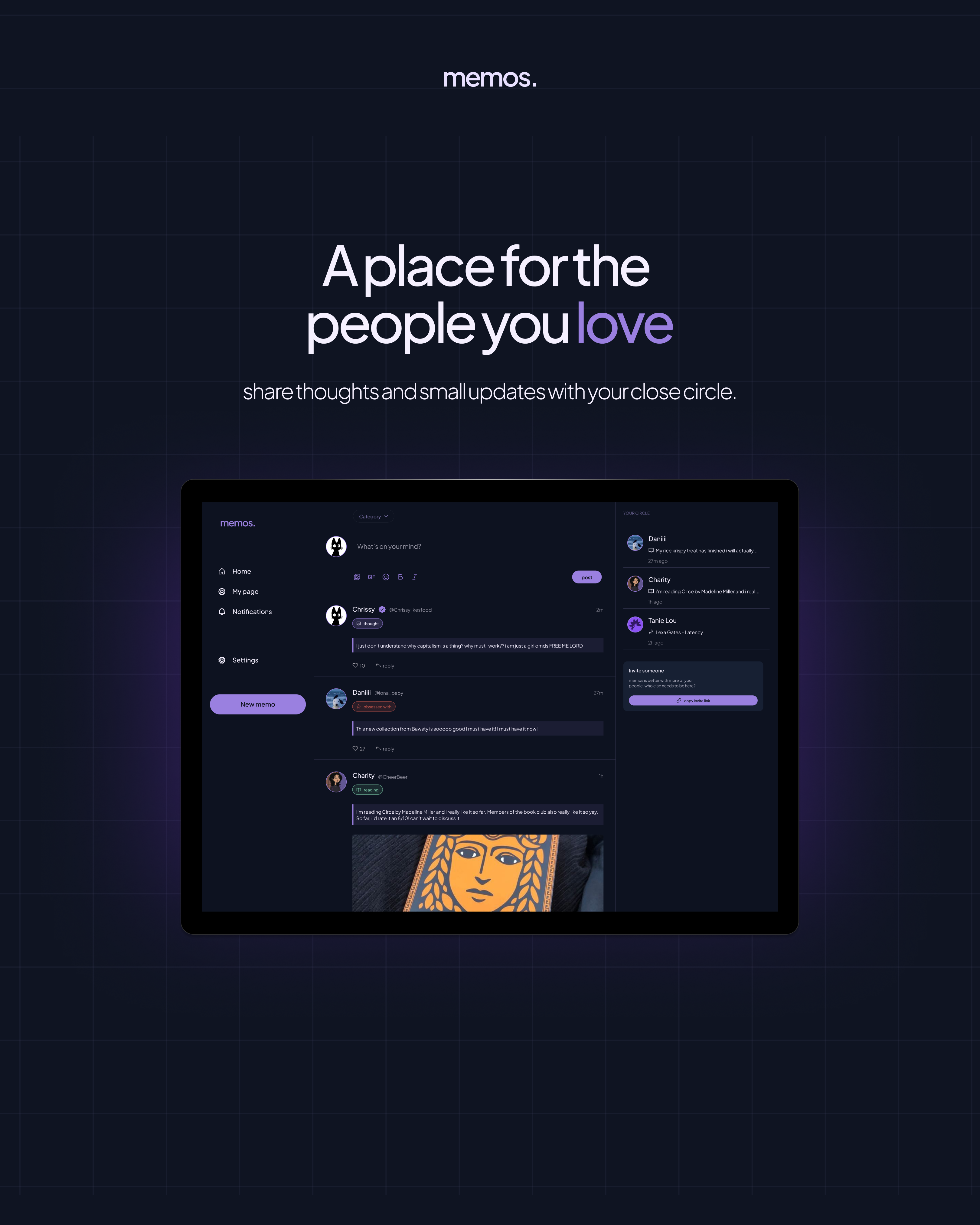
The Now Page is the heart of the product — a live feed of what your circle is reading, listening to, watching, and thinking about, right now.
I came in with three things already decided:
- a three-column grid
- infinite scroll, and
- navigation that felt familiar.
I started with nav because it was the quickest win and set the tone for everything else. Then the cards.
The cards are where memos lives. Every post is a card, and each one had to hold four different content types — thought, read, watch, listen — while still feeling like the same product. Each type had its own colour logic from the design system. The card also had to carry interactions: an animated like button, reply threads, multiple states. A lot to ask of one component, so I built it piece by piece.
The build is still in progress. But the foundation is there.
Key Lesson #4
The components that look simple are usually the ones that need the most thought. Read my article on this here
THE NEXT STEPS
Memos is still being built. The landing page is live at and collecting waitlist signups.
The full design — onboarding, Now Page, components, design system — is done in Figma. The code is in progress.
There's more to come: the full authentication flow, the invite system, notifications, and eventually getting real people into the product. But the bones are there, and the vision hasn't changed since February 20th.
visit the site


Cool project? Cool people?
My inbox is open ;p
hi@elisha.ma


Go Back

2026
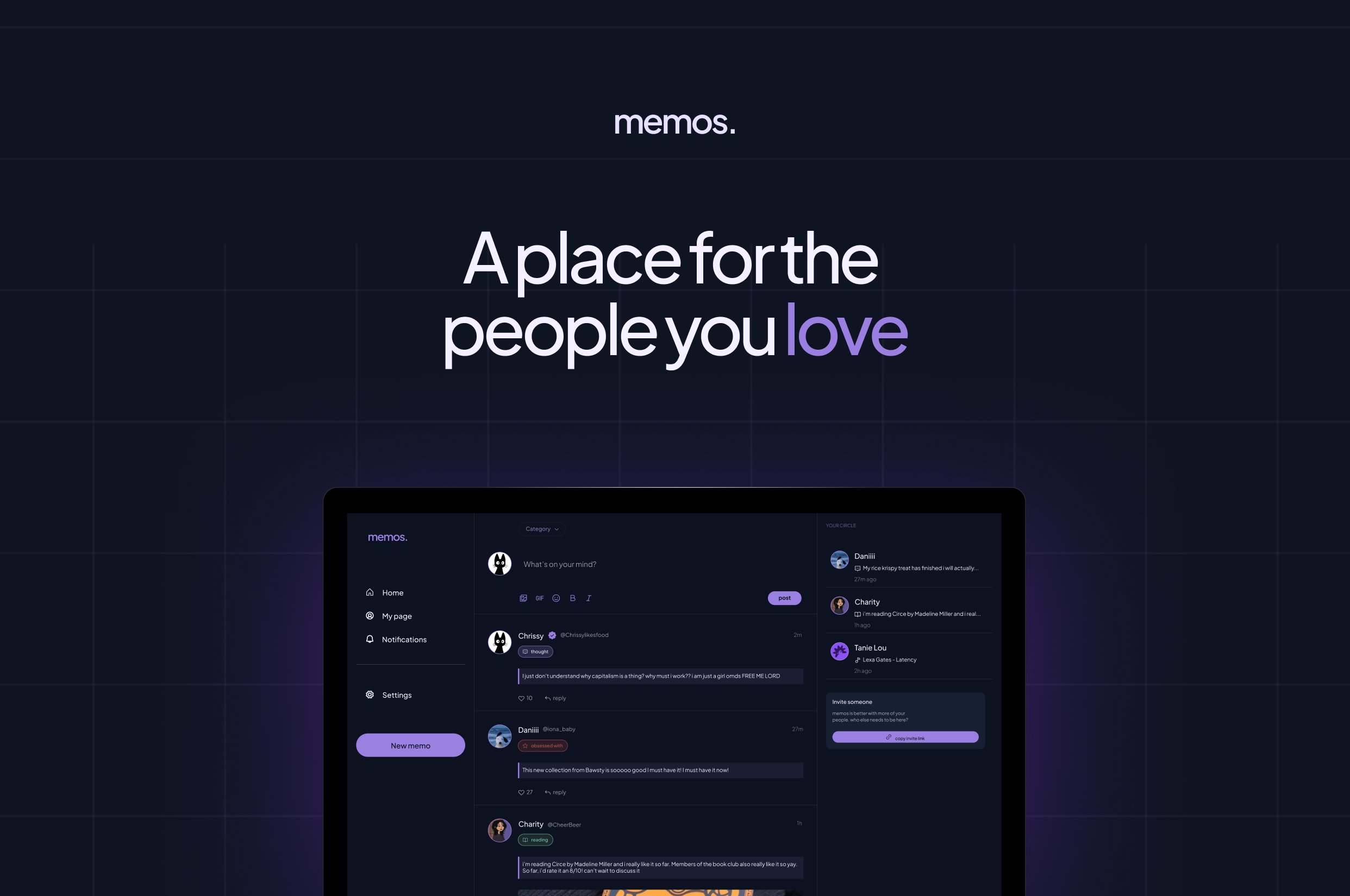
A private social app for sharing what you love, with the people you love.
Timeline
February 2026
Role
Product Designer & Developer

OVERVIEW
Memos is an invite-only social app born out of being genuinely tired of mindless scrolling.
It started on February 20th, 2026. I was tired of opening six different apps to know what my friends were up to. Twitter for opinions. Instagram stories for updates. Snapchat for streaks. WhatsApp for messages. iMessage for more messages. It was too much, and none of it felt like it was actually for me and my people.
The four things that kept coming up in every conversation with friends were always the same: what they were thinking, reading, watching, listening to. We were always consuming something, always turning ideas over. But there was no one place to put it all — just for your circle, without the noise.
So I decided to build it. The irony of solving a too-many-apps problem with another app is not lost on me. But the difference is intention. Memos is invite-only, private by default, and built for depth over reach. No algorithm. No performing for strangers. Just your people.
I designed it, and then I brought it to life with code.
THE PROBLEM
Before I touched Figma I wrote everything down; the problem, the features, what I actually wanted this product to feel like
I built a v1 PRD and a design system from scratch: typography, colour, components. I wanted the product to feel quiet and considered, so I made sure the foundation reflected that before a single screen existed.
With Memos, I wanted to explore a different question:
- What if a social app was private by default?
- What if it was built for depth over breadth?
- What if the feed only had people you actually loved?
THE THINKING
- Starting with the concept, not the screen
The design system came first. Before any screens, I built the foundation — typography, colour, components. I wanted the product to feel deliberate and considered, and that had to start at the system level.
The colour story started with two things: deep navy and lavender. Navy grounds everything: it's the base, the background, the weight, it is also a familiar dark shade. Lavender lifts it. Cool, quiet, a little dreamy. Together they feel like a late evening. I built out a full navy scale and lavender scale, plus semantic colours for the content types: green for saved, red for errors, blue for info, and a softer purple specifically for thoughts and journal entries.
For typography I chose Plus Jakarta Sans — clean and modern. One typeface, all weights, and it holds up at every size from display down to body text. The type scale was written in the language of the product itself: "your little world," "what's going on," "your friends, lately" ; Defining the product language and voice before designing.
Key Lesson #1
The product has to feel like itself before any screens exist. That's what a design system is for.
- Building a destination for memos
The landing page came next. I made an early call to ship a waitlist before building the full product — partly to get something out into the world, partly to pressure-test whether people actually wanted this. I kept asking myself whether a landing page was just prolonging the journey. I looked at how Twitter and Bluesky handle first visits — neither has one. But those are established products that people already know. Memos needed to earn the click first.
The structure was straightforward: nav, hero, a mid-section for context, a terminology translator (memos has its own language) and a footer. Getting it from Figma to code was a different story. Claude is fast, it'll generate 200 lines of HTML in seconds, but it doesn't have taste and it doesn't know your spacing system unless you force it to. So the workflow became:
- Design in Figma
- Ask Claude to translate the structure
- Rewrite half of it
- Fix spacing manually
- Debug when it broke.
I call it hybrid code. AI speeds up the structure, but the taste is still on you.
The waitlist had its own problem. I was using Tally to collect emails, but my landing page already had an email input — meaning users would type their email, get redirected to Tally, and be asked for it again. One unnecessary step. I figured out how to pass the email as a URL parameter so Tally prefilled it on arrival. A small fix, but it mattered.
Then came deployment — GitHub, then Vercel. A URL was born.
Key Lesson #2
Taste is how you spot errors. AI speeds up structure, not taste. Read my article on building memos landing page here
- Onboarding as a guided and deliberate experience
Onboarding was where I spent the most time thinking. For a product that only works with friends, it couldn't just be account setup — it had to be a guided introduction to what memos even is. New product, new concept, new behaviour. I couldn't just drop someone into a feed and hope they figured it out.
I approached the design as a journey with a clear job to do at each step. Not just collecting information, but building investment — making sure that by the time someone finished onboarding, they already felt like memos was theirs.
The four steps:
- Create your account: Email, password, display name. Standard, but necessary. This is the entry point and it needed to feel frictionless i.e, no unnecessary fields & nothing that made you pause.
- Make it yours: Pick your avatar colour & write a one-line bio. I wanted this step to feel light and fun, not like a form. The avatar colour especially — it's a small thing, but it gives you something visual to own before you've posted anything.
- Your first memo: This was the most deliberate decision in the entire onboarding. The product only works if there's something in it — so I made posting your first memo part of the setup itself. You fill in just one before you can invite anyone. What are you reading right now? What's been on repeat? It gets you invested before your friends even arrive. And when they do, they're not walking into an empty room. They're walking into yours.
- Invite your circle: The last step, and in a way, the most important one. Memos without friends is just a journal. This is the moment the product actually becomes what it's supposed to be; you share your unique link and bring your people in.
Key Lesson #3
The sequence matters as much as the steps. What you ask people to do first shapes everything that comes after.
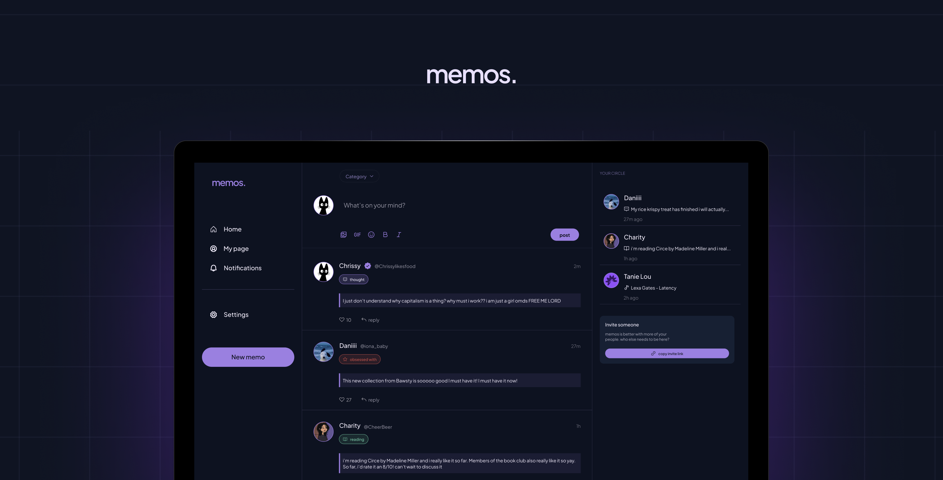
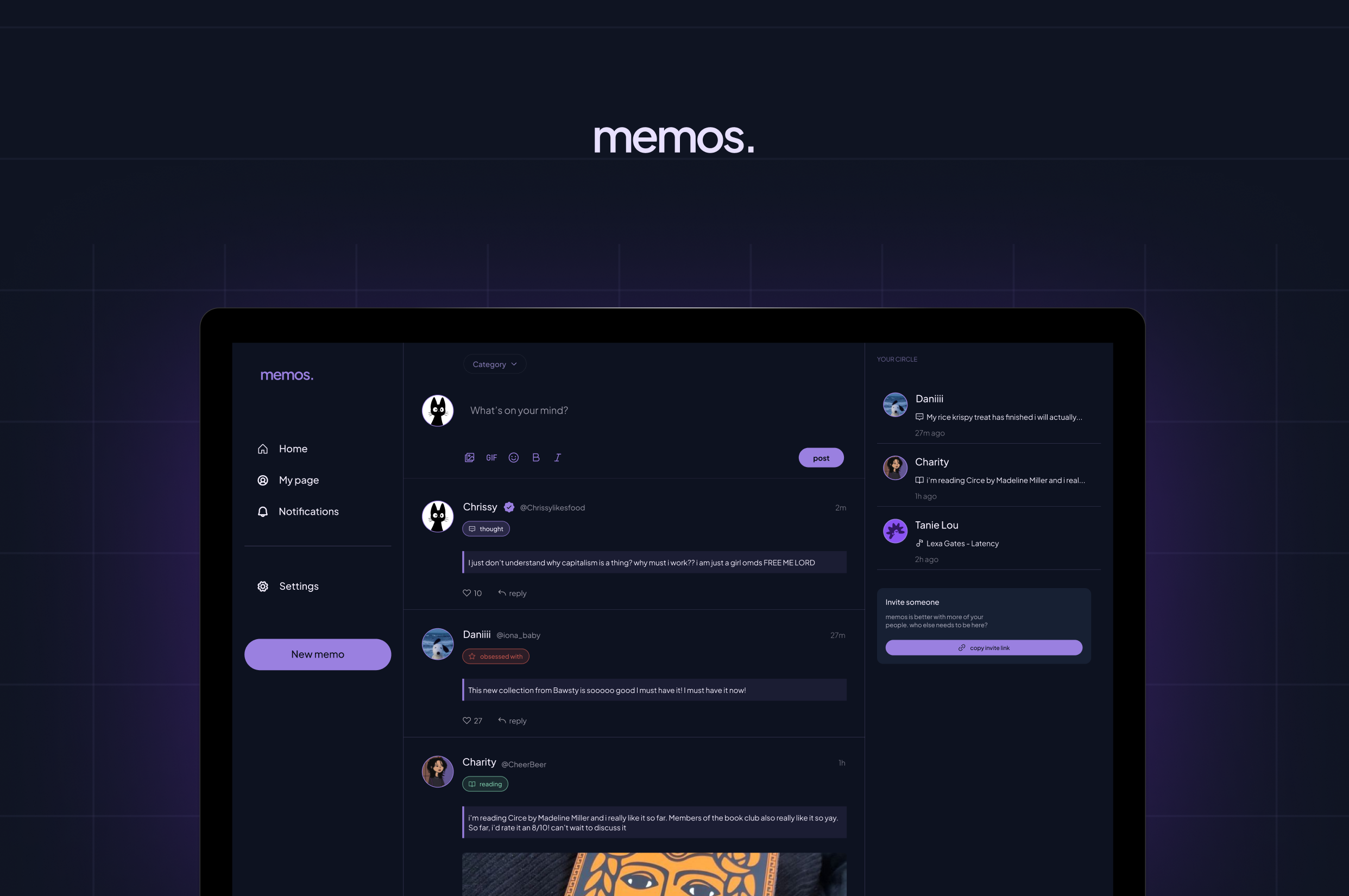
- A home (now-page) for your memos
The Now Page is the heart of the product — a live feed of what your circle is reading, listening to, watching, and thinking about, right now.
I came in with three things already decided:
- a three-column grid
- infinite scroll, and
- navigation that felt familiar.
I started with nav because it was the quickest win and set the tone for everything else. Then the cards.
The cards are where memos lives. Every post is a card, and each one had to hold four different content types — thought, read, watch, listen — while still feeling like the same product. Each type had its own colour logic from the design system. The card also had to carry interactions: an animated like button, reply threads, multiple states. A lot to ask of one component, so I built it piece by piece.
The build is still in progress. But the foundation is there.
Key Lesson #4
The components that look simple are usually the ones that need the most thought. Read my article on this here
THE NEXT STEPS
Memos is still being built. The landing page is live at and collecting waitlist signups.
The full design — onboarding, Now Page, components, design system — is done in Figma. The code is in progress.
There's more to come: the full authentication flow, the invite system, notifications, and eventually getting real people into the product. But the bones are there, and the vision hasn't changed since February 20th.
visit the site
Cool project? Cool people?
My inbox is open ;p
hi@elisha.ma
Go Back
2026
A private social app for sharing what you love, with the people you love.
Timeline
February 2026
Role
Product Designer & Developer
OVERVIEW
Memos is an invite-only social app born out of being genuinely tired of mindless scrolling.
It started on February 20th, 2026. I was tired of opening six different apps to know what my friends were up to. Twitter for opinions. Instagram stories for updates. Snapchat for streaks. WhatsApp for messages. iMessage for more messages. It was too much, and none of it felt like it was actually for me and my people.
The four things that kept coming up in every conversation with friends were always the same: what they were thinking, reading, watching, listening to. We were always consuming something, always turning ideas over. But there was no one place to put it all — just for your circle, without the noise.
So I decided to build it. The irony of solving a too-many-apps problem with another app is not lost on me. But the difference is intention. Memos is invite-only, private by default, and built for depth over reach. No algorithm. No performing for strangers. Just your people.
I designed it, and then I brought it to life with code.
THE PROBLEM
Before I touched Figma I wrote everything down; the problem, the features, what I actually wanted this product to feel like
I built a v1 PRD and a design system from scratch: typography, colour, components. I wanted the product to feel quiet and considered, so I made sure the foundation reflected that before a single screen existed.
With Memos, I wanted to explore a different question:
- What if a social app was private by default?
- What if it was built for depth over breadth?
- What if the feed only had people you actually loved?
THE THINKING
- Starting with the concept, not the screen
The design system came first. Before any screens, I built the foundation — typography, colour, components. I wanted the product to feel deliberate and considered, and that had to start at the system level.
The colour story started with two things: deep navy and lavender. Navy grounds everything: it's the base, the background, the weight, it is also a familiar dark shade. Lavender lifts it. Cool, quiet, a little dreamy. Together they feel like a late evening. I built out a full navy scale and lavender scale, plus semantic colours for the content types: green for saved, red for errors, blue for info, and a softer purple specifically for thoughts and journal entries.
For typography I chose Plus Jakarta Sans — clean and modern. One typeface, all weights, and it holds up at every size from display down to body text. The type scale was written in the language of the product itself: "your little world," "what's going on," "your friends, lately" ; Defining the product language and voice before designing.
Key Lesson #1
The product has to feel like itself before any screens exist. That's what a design system is for.
- Building a destination for memos
The landing page came next. I made an early call to ship a waitlist before building the full product — partly to get something out into the world, partly to pressure-test whether people actually wanted this. I kept asking myself whether a landing page was just prolonging the journey. I looked at how Twitter and Bluesky handle first visits — neither has one. But those are established products that people already know. Memos needed to earn the click first.
The structure was straightforward: nav, hero, a mid-section for context, a terminology translator (memos has its own language) and a footer. Getting it from Figma to code was a different story. Claude is fast, it'll generate 200 lines of HTML in seconds, but it doesn't have taste and it doesn't know your spacing system unless you force it to. So the workflow became:
- Design in Figma
- Ask Claude to translate the structure
- Rewrite half of it
- Fix spacing manually
- Debug when it broke.
I call it hybrid code. AI speeds up the structure, but the taste is still on you.
The waitlist had its own problem. I was using Tally to collect emails, but my landing page already had an email input — meaning users would type their email, get redirected to Tally, and be asked for it again. One unnecessary step. I figured out how to pass the email as a URL parameter so Tally prefilled it on arrival. A small fix, but it mattered.
Then came deployment — GitHub, then Vercel. A URL was born.
Key Lesson #2
Taste is how you spot errors. AI speeds up structure, not taste. Read my article on building memos landing page here
- Onboarding as a guided and deliberate experience
Onboarding was where I spent the most time thinking. For a product that only works with friends, it couldn't just be account setup — it had to be a guided introduction to what memos even is. New product, new concept, new behaviour. I couldn't just drop someone into a feed and hope they figured it out.
I approached the design as a journey with a clear job to do at each step. Not just collecting information, but building investment — making sure that by the time someone finished onboarding, they already felt like memos was theirs.
The four steps:
- Create your account: Email, password, display name. Standard, but necessary. This is the entry point and it needed to feel frictionless i.e, no unnecessary fields & nothing that made you pause.
- Make it yours: Pick your avatar colour & write a one-line bio. I wanted this step to feel light and fun, not like a form. The avatar colour especially — it's a small thing, but it gives you something visual to own before you've posted anything.
- Your first memo: This was the most deliberate decision in the entire onboarding. The product only works if there's something in it — so I made posting your first memo part of the setup itself. You fill in just one before you can invite anyone. What are you reading right now? What's been on repeat? It gets you invested before your friends even arrive. And when they do, they're not walking into an empty room. They're walking into yours.
- Invite your circle: The last step, and in a way, the most important one. Memos without friends is just a journal. This is the moment the product actually becomes what it's supposed to be; you share your unique link and bring your people in.
Key Lesson #3
The sequence matters as much as the steps. What you ask people to do first shapes everything that comes after.
- A home (now-page) for your memos
The Now Page is the heart of the product — a live feed of what your circle is reading, listening to, watching, and thinking about, right now.
I came in with three things already decided:
- a three-column grid
- infinite scroll, and
- navigation that felt familiar.
I started with nav because it was the quickest win and set the tone for everything else. Then the cards.
The cards are where memos lives. Every post is a card, and each one had to hold four different content types — thought, read, watch, listen — while still feeling like the same product. Each type had its own colour logic from the design system. The card also had to carry interactions: an animated like button, reply threads, multiple states. A lot to ask of one component, so I built it piece by piece.
The build is still in progress. But the foundation is there.
Key Lesson #4
The components that look simple are usually the ones that need the most thought. Read my article on this here
THE NEXT STEPS
Memos is still being built. The landing page is live at and collecting waitlist signups.
The full design — onboarding, Now Page, components, design system — is done in Figma. The code is in progress.
There's more to come: the full authentication flow, the invite system, notifications, and eventually getting real people into the product. But the bones are there, and the vision hasn't changed since February 20th.
visit the site
Cool project? Cool people?
My inbox is open ;p
hi@elisha.ma